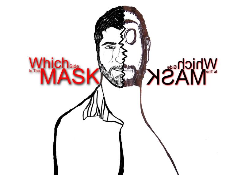
I'm making a book of my work and i've settled on a classic type cover with a simple graphic. However i've got 2 choices and am not quite sure which to pick. I'll let you guys have some input.
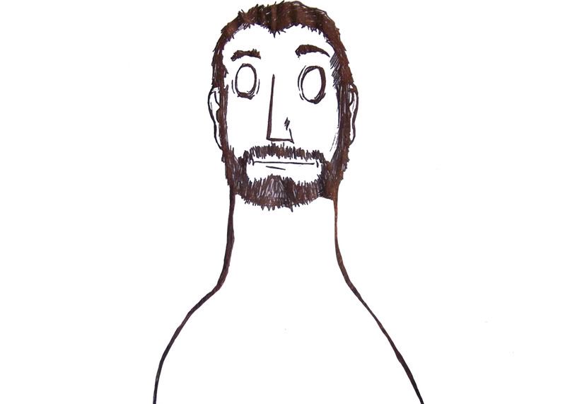
Just a self portrait done in a very cartoony surreal style.
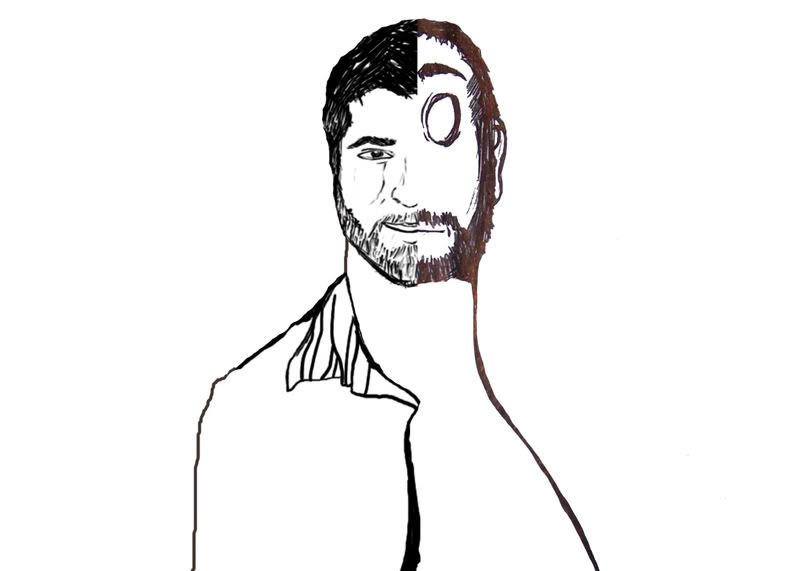
The above image combined with with a realistic portrait. The idea is the combining the serious more realistic side of myself with the goofy cartoony side.
Id go with the top one. The half and half doesnt seem to flow together.
If you like that kind of idea though, maybe try a full drawling of yourself in the realistic style. Then use teh cartoon style as a shadow that trails off behind you. Or something to that effect.
If you cutoff the head and just look at everything chin-down it looks real bizzaro. Kinda cool. I'd have to say just the very first picture. Half-half designs are incredibly hard to pull off even though the one you made looks surprisingly good together. Vote is with the first regardless.